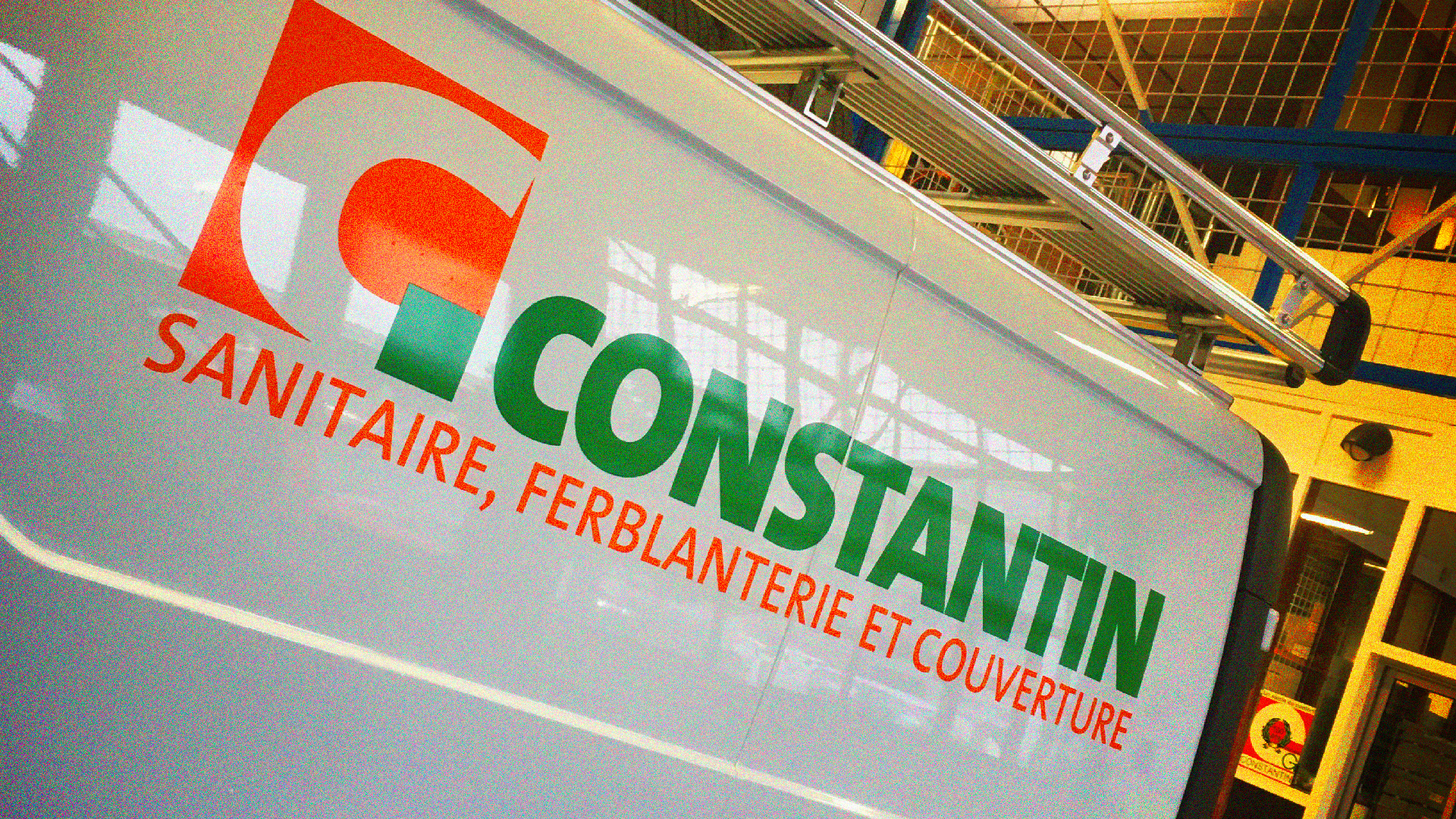
Active for several generations in the construction industry, constantin needed to review its logo. The challenge was to rejuvenate the brand while maintaining its essence. This has been achieved, with this evolution which saturates the colours, modernises the typography, but does not change anything in the eyes of the historical clients!


